Decorating your home has never been easy, especially if you are not an expert on it. Since it is New Year, some things need to change, especially if you are inclined to follow the current trend. In one of the articles of Rafael Bermejo, he suggested some ideas regarding decorative pairing:
6 Decorating Duos to Consider Now
Baby pink and blue. Pantone's somewhat controversial decision to showcase not one but two colors for this year's Color of the Year seems a natural place to kick-start our pair-ups. The thought leaders in color have predicted that sweet pink Rose Quartz and soft purplish-blue Serenity are going to be big this year, bringing light and peace into our lives over more oppressive hues such as Marsala red (Pantone's pick last year).
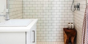
Geometrics and tiles.
Concrete tiles featuring geometric and decorative patterns are coming back into favor all over the world. These patterns translate easily to any space, whether for living room flooring, bathroom wall tiles, stair coverings or kitchen walls. See more...
In the context of decorative pairing, even beyond home design, things should express harmony. You should try to look for materialize or objects that will harmonize with each other, concordance is the key to achieving a beautifully paired home decor. However, in pairing objects and designs, you should not also sacrifice your own personality or taste just for some objects to blend accordingly.
These are just mere suggestions which you may choose not to follow. You have your own choice or taste of design; it would be better to follow it than to be stuck in a trend that in the very first place you may not appreciate. In deciding what is best for your home, never sacrifice your own convenience over fashion or trend, for things as such will soon be replaced and may soon be revived as well.